wxMaxima wxplot Tutorial
Aus http://wxmaxima.sourceforge.net/ Ergänzungen auf Deutsch von Ha
Mathematik in wxMaxima www.mathematik-verstehen.de Haftendorn Okt 2010
Achtung: Durch Anklicken der linken Zellmarkierung kann man die
Abschnitte und auch einzelne Zellen aufklappen und auch wieder zuklappen.
Dazu Shift halten, dann werden auch alle Unterebenen aufgeklappt.
Endung *.wxmx ist komfortabel. Ist die Endung *.wxm muss man
erst noch alle Ausgaben neu erzeugen. Mit Strg r werden alle aufgeklappten Zellen ausgewertet.
Zum Lernen ist es besser die Zellen einzeln (mit Shift+Enter) auszuwerten.
Werte einzelne Zellen aus mit Shift-Enter.
Auswertung in einem Rutsch: Falte alle Abschnitte auf,
werte alle Zellen mit Strg r aus ( auch Menu Cell Alle Zellen auswerten).
0.1 Beachten Sie "Graphen2d-sytematisch.wxmx" !!!!
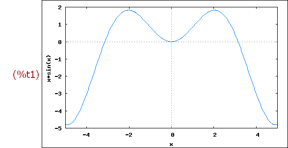
1 Plotting a Single Variable
The plot below is generated by selecting Plot/Plot 2d from the menu or by clicking on
the Plot2D button at the bottom of the screen. Alternatively, the command can be entered directly
into the cell.
To execute any command below, use "Ctrl-Enter" or "Shift-Enter".
(%i1)
wxplot2d([x*sin(x)], [x,-5,5])$
Note: At any time, a graph may be saved to a file. Click on the image to be saved.
Rechte Maustaste für Kopieren oder Speichern. Das Format png ist für Strichzeihnungen
sinnvoll. jpg ist aber wählbar.
Then select the menu item Edit/Selection to image and save the graph.
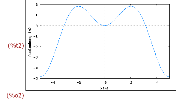
We now add labels to the horizontal and vertical axes. Notice wxMaxima's use of
lists. Each new set of instructions consists of a list of items.
(%i2)
wxplot2d([x*sin(x)], [x,-5,5], [xlabel, "x(m)"], [ylabel, "Auslenkung (m)"]);
2 Controlling Proportions and Showing Two Functions
2.1 Erste Annäherung
For some purposes, one might want to control the y axis as well as the x axis.
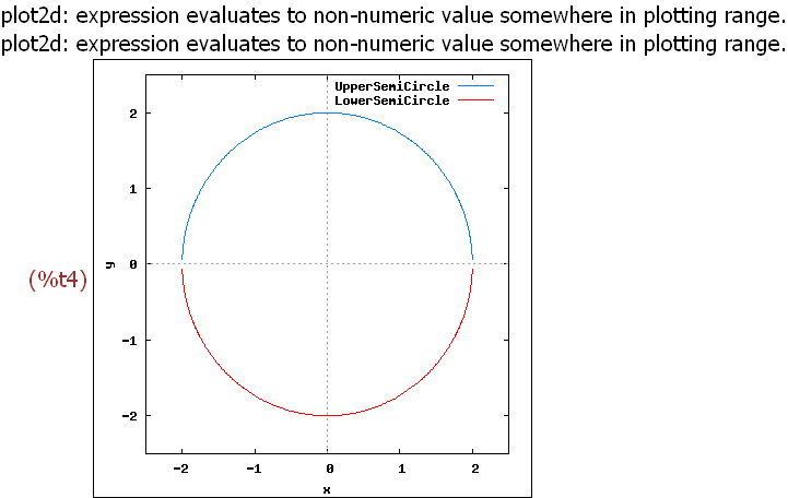
Consider the following function, which draws a circle using two explicit functions.
The figure below raises two issues regarding the presentation of the functions, the question
of scale and the definition of a legend to identify individual functions.
(%i3)
wxplot2d([sqrt(4-x^2),-sqrt(4-x^2)], [x,-2.5,2.5],[y,-2.5,2.5])$
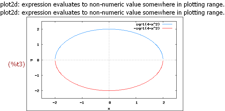
Two aspects of this graph warrant concern. Most obviously, the "circle" looks
decidedly non-spherical. Second, a legend has appeared, one that we might
want to make more informative. A legend appears automatically whenever more
than one function is being plotted.
The first problem relates to the fact that Maxima does not assume that x and y
axis have the same units, and it stretches the figure so that the a centimeter along
the vertical axis accounts for more units that a centimeter does along the
horizontal axis.
To avoid this distortion, instruct wxplot2d to produce a square graph.
Entweder durch Angabe von direkten Pixeln (1) oder durch Angabe eines
dezimalen Seitenverhältnisses (2) kann man die Gleichheit der Achsenmaße
erzwingen
(2) Another option for removing the distortion appears below. in Abschnitt 4.1
Achtung!!!! diese Fragestellung ist in Abschnitt 4 umfassender behandelt.
To add content to the legend, add a legend option.
(%i4)
wxplot2d([sqrt(4-x^2),-sqrt(4-x^2)], [x,-2.5,2.5],[y,-2.5,2.5],
[legend, "UpperSemiCircle", "LowerSemiCircle"]),wxplot_size=[400,400]$
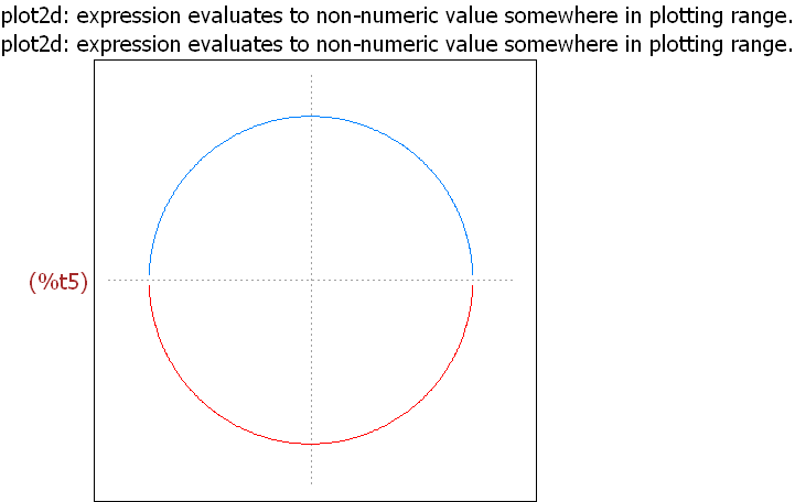
Suppose we want a cleaner display. We could suppress the legend, as below.
Also, we see later in the tutorial that it would be possible to make both halves
of the circle the same color.
Furthermore,we can remove the box around the circle and the information
about units, as well as the axis labels.
(%i5)
wxplot2d([sqrt(4-x^2),-sqrt(4-x^2)], [x,-2.5,2.5],[y,-2.5,2.5],
[legend, false], [box,false], [xlabel, ""], [ylabel, ""]),
wxplot_size=[400,400]$
2.2 Further Issues in Presenting Functions
Einige Ergänzungen aus dem maxima-Original-Tool
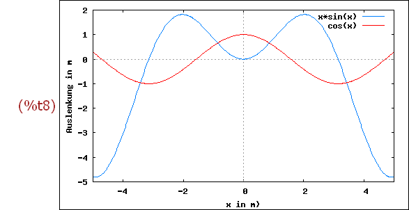
Return to the example with which this tutorial began, and add one more function.
At the same time, make one more change by defining the functions before specifying
the wxplot2d command. Now, enter the functions' names into the list of functions
(which had previously contained a single entry, the function now designated as f(x).
A warning: If you use this approach, save this session as a batch (wxm) file, and execute
it later, you must execute the input below before executing any other commands that
refer to f(x) or g(x).
(%i6)
f(x) := x*sin(x)$
g(x) := cos(x)$
wxplot2d([f(x),g(x)], [x,-5,5], [xlabel, "x in m)"],
[ylabel, "Auslenkung in m"] )$
/*
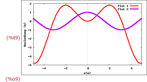
Next, change the label entries to "Plot 1" and "Plot 2" and change the line styles.
Plot 1 (x*sin(x)) dicker und rot. Plot 2 (cos(x)) becomes
wider (width = 4) and the color changes to lila (color code = 4).
The Maxima Manual provides the codes.
(%i9)
wxplot2d([f(x),g(x)], [x,-5,5], [xlabel, "x(m)"],
[ylabel, "Auslenkung (m)"],
[legend, "Plot 1", "Plot 2"], [style,[lines,3,2],[lines,4,4]]
);
One final set of changes adds some useful details to this graph. Adding these
details involves inserting a "gnuplot_preamble" which is a list of options not
available directly in the wxplot2d command.
xwmaxima greift hier aus die umfassenderen Möglichkeitne von maxima selbst
(der Komandozeilenversion) zurück. Aus die Version beziehen sich auch z.T. die
offiziellen Hilfeseiten.
The following options are used:
The key (legend) moves to the bottom center. It could be set at
bottom left, bottom right, left center, right center, and so forth.
A title is added to the figure.
Note the syntax. All options are part of a list, with gnuplot_preamble as the
first item in the list.
Listen erkennt man an den eckigen Klammern [1,2,3], die Elemente durch Komma getrennt.
All options are between double quotation marks.
Each item ends with a semicolon. Text entries are within single quotation marks.
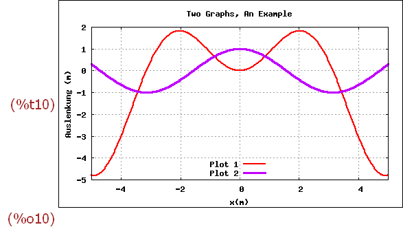
(%i10)
wxplot2d([f(x),g(x)], [x,-5,5], [xlabel, "x(m)"], [ylabel, "Auslenkung (m)"],
[legend, "Plot 1", "Plot 2"], [style,[lines,2,2],[lines,3,4]],
[gnuplot_preamble, " set grid; set key bottom center;
set title 'Two Graphs, An Example'; "] );
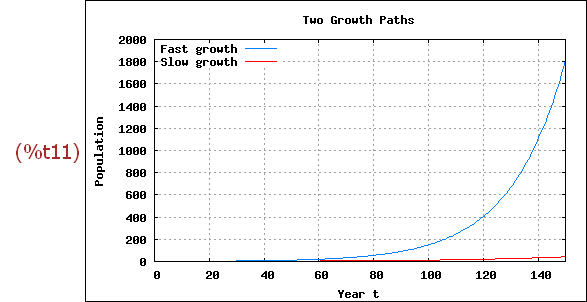
A final use of the preamble is to set the y axis to logarithmic scale. Consider
a simple growth function: y(t) = exp(g*t), were t is a time unit.
exp(x) die die Eulerfunktion e^x
The two graphs
below show two functions, fast growth, with g = 5% per year, and slow growth,
with g = 2% per year.
(%i11)
wxplot2d([exp(0.05*t),exp(0.025*t)], [t,0,150],[ylabel, "Population"],
[xlabel, "Year t"], [legend, "Fast growth", "Slow growth"],
[gnuplot_preamble, " set grid; set key top left;
set title 'Two Growth Paths'; "] )$
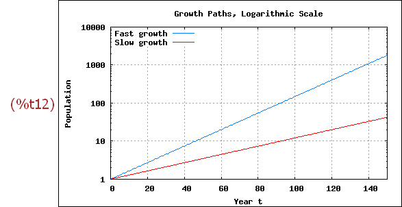
Converting the vertical axis to the logarithmic scale accomplishes two tasks.
"Slow growth" is not dwarfed by "Fast growth" and the constancy of the
rates of growth is emphasized.
The conversion to logs requires adding set logscale y; to the gnuplot_preamble.
(%i12)
wxplot2d([exp(0.05*t),exp(0.025*t)], [t,0,150],[ylabel, "Population"],
[xlabel, "Year t"], [legend, "Fast growth", "Slow growth"],
[gnuplot_preamble, " set grid; set key top left;
set title 'Growth Paths, Logarithmic Scale'; set logscale y; "] )$
3 Gleiche Einheiten für x- und y-Achse
3.1 Vorschlag 1 des Tutorials
A final point: Earlier we showed one way to "square" a display, making the
horizontal and vertical units the same. Another way to do this uses the
gnuplot_preamble.
Return to the illustration in which a circle is drawn as two explicit functions
of variable x.
Have gnuplot_preamble add a title and to give x and y the same units.
The legend is removed to reduce clutter. (reduzieren der Überhäufung)
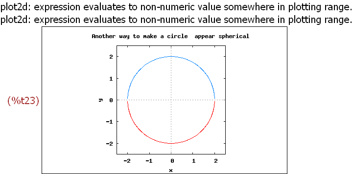
(%i13)
wxplot2d([sqrt(4-x^2),-sqrt(4-x^2)], [x,-2.5,2.5],[y,-2.5,2.5],
[legend, false],
[gnuplot_preamble, "set title 'Another way to make a circle
appear spherical'; set size ratio 1;"] )$

Das ist etwas sehr einfach, da hier das Quadrat auch in x- und y-Breite gewäht ist.
Das nächste zeigt, dass es noch etwas zu tun gibt.
(%i14)
wxplot2d([sqrt(4-x^2),-sqrt(4-x^2),sqrt(4-(x-2)^2),-sqrt(4-(x-2)^2)], [x,-2,4.
],[y,-2,2],
[legend, false],
[gnuplot_preamble, "set title 'Another way to make a circle
appear spherical'; set size ratio 0.666666;"]);
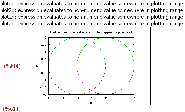
Um also auch diese Kreise richtig darzustellen, musste das Seitenverhältnis 2/3
eingegeben werden, aber der Bruch wurde nicht verstanden.
Leider war es auch nicht möglich, an die Stelle einen Term oder eine Variable
zu setzen.
3.2 Vorschlag 2: Übliches Format, aber ymax1 selbst berechnen
(%i15)
(xmin:-1,xmax:2,ymin:-0.2,ymax:2)$
ymax1:ymin+0.6*(xmax-xmin) /*Nimm ymax1 für gleichen Maßstab*/;
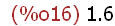
(%i17)
wxplot2d([1/2*x^2], [x,xmin,xmax], [y,ymin,ymax1])$
Die Idee ist: Die Fenster sind fast goldene Rechtecke. ymax1 ist so berechnet,
dass sich damit ein goldenes Rechteck aus der Breite ergibt.
Darum sind nun die Einheiten rechts und und oben gleich lang.
Oft wird das ja schon reichen für einen schulisch sinnvollen Eindruck.
Notfalls experimentiert man ein wenig mit anderen Grenzen.
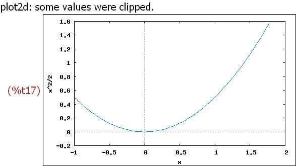
3.3 Vorschlag 3: Grenzen wünschen, aber Format ändern
(%i18)
(xmin:-1,xmax:2,ymin:-0.2,ymax:3)$
(xpix:400, ypix:(ymax-ymin)/(xmax-xmin)*xpix);

(%i20)
wxplot2d([1/2*x^2], [x,xmin,xmax], [y,ymin,ymax]),
wxplot_size=[xpix,ypix];
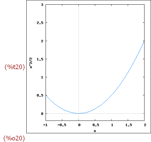
4 Graphen verschiedenen Typs
4.1 parametrische Kurven
Archimedische Spirale
(%i21)
wxplot2d([parametric,t*cos(t),t*sin(t)], [t,0,20])$
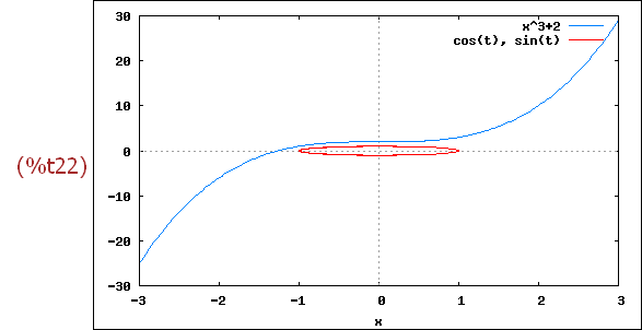
(%i22)
wxplot2d([x^3+2, [parametric, cos(t), sin(t), [t, -5, 5],
[nticks, 80]]], [x, -3, 3])$
(%i23)
wxplot2d([sqrt(4-x^2),-sqrt(4-x^2)], [x,-2.5,2.5],[y,-2.5,2.5],
[legend, false],
[gnuplot_preamble, "set title 'Another way to make a circle
appear spherical'; set size ratio 1;"])$
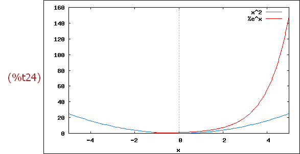
(%i24)
wxplot2d([x^2,exp(x)], [x,-5,5])$